01Context
Two clients, two incentives
The company buys; the person uses. One wants proof the investment works, the other wants to feel better without feeling watched.
In between, a wellbeing team has to run the program, and the product has to make all of it feel like a single experience.
02The problem
An ecosystem, not an app
Every actor needed something different from the same product. Designing for just one of them broke it for everyone else.
- 01HR needs to measure results and justify the investment.
- 02Employees need to trust the product before answering honestly.
- 03The wellbeing team needs to run content and follow-up.
- 04Product has to turn all of that into one coherent experience.
03The ecosystem
Who gives and who gets
I mapped what each actor gives and gets. The platform isn't the center because it's the app: it's where every promise meets.
- Company / HRBuys · communicates · gets insights
- PlatformOnboarding · assessment · content · recommendations
- EmployeeAnswers · gets value · comes back
- Wellbeing teamContent · intervention · follow-up
- Data / analyticsAggregation · privacy · reporting
04Research
What people say vs. what they do
I cross-referenced self-perception questionnaires with real product usage. The gap between them showed where to intervene.
05The flows
Wellbeing without feeling audited
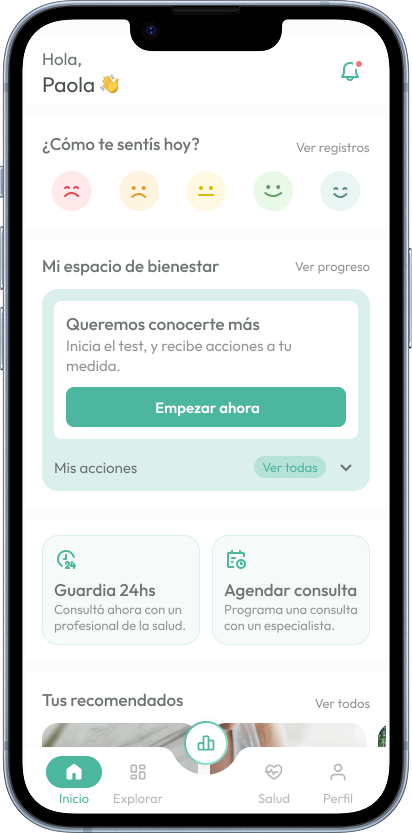
The challenge wasn't usability, it was trust. Every question gives something back before asking the next, and it's clear what the company can and can't see.
06The system
The design system that made it scale
With several actors across web and mobile, consistency wasn't aesthetics: it was trust. I built the design system so every new flow speaks the same language without re-arguing buttons and states.
- 01Tokens: color, type, spacing, radii and elevation.
- 027 states per component, including empty and error.
- 03One library for web and mobile, no duplicated components.
07Decisions
Build the system alongside features, not before
The roadmap couldn't stop for two months.
Every component was born from a real case, and the system showed value from week one.
Employee privacy over reporting detail
The company wants results; the employee wants not to be identified.
If employees suspect they can be identified, they stop answering honestly and the data loses value for everyone.
08AI in the process
AI to decide faster
I use AI to synthesize questionnaires and research, and to go from an idea to a clickable prototype in hours. That lets us validate flows with users before committing engineering.
- Claude
- Figma Make
- v0
09What I took away
- In B2B2C, designing for whoever pays without losing whoever uses is the real product problem.
- In healthcare, trust is part of usability.
- A Design System is sold with team metrics, not pretty screenshots.